
![]()
Inverted Yield Curve#
Dr. Nicholas Jacob
East Central University
Spring 2022
CPSMA 4313
Instructor: Dr. Nicholas Jacob
Abstract: The yield curve has been a reliable predictor of recessions in the US without any false positives going back 60+ years. Recently the yield curve inverted predicitng a possible recession. Here we will examine the news reporting on this esoteric but important predictor to see how the media provides coverage of a possible recession indicator.
The yield curve was first examined by Campbell Harvey in 1986 in his doctoral disertation. In his thesis, he noted that when long term interests rates fell below short term interests rates in the US treasuries market, the market was not acting rationally. People are much more willing to lend money short term for less of a return than they would be for long term but sometimes this can invert! The inversion is most likely cause by pessimism in the short term outlook of the markets and investors move their money into shorter term instruments to ride out the turmoil. The inversion of the 10 year and 3 month treasuries for a quarter or more has acturately predicted every recession for the past 7 business cycles.
The 2 year and 10 year treasuries just inverted, meaning the 2 year provided less yield than the 10 year note. This inversion was short lived but the media did report on it in several places. We will examine these news reports to see how they use visualizations to discuss this important indicator.
CNBC#
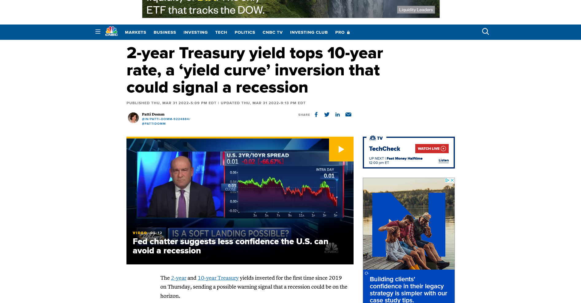
The screenshot of CNBC was taken from https://www.cnbc.com/2022/03/31/2-year-treasury-yield-tops-10-year-rate-a-yield-curve-inversion-that-could-signal-a-recession.html on 4/14/21
We note that the visualiztion we will examine here was inbedded in a video but with the screeenshot we can still examine it for graphical excellence.
The network CNBC is a 24 hour business news TV broadcaster. 24 hour news tends to sensationalize news stories to help increase viewership. We will look at this visualization in that lense. While the graphic itself is benign, the title of the article does use the word recession which is generally a scary topic. Th graphic does contain both green and red but these are use to signify the position of the indicator relative to the close in the previous day. We also see the current position (Intra Day) clearly marked on the screen in several places. Below the title we see the movement for the indicator in both actual terms and percentage terms, presumably based on the previous day’s close. This graphic is a time-series graph as the x axis is the time and the y axis is the level of the indicator.
Overall this is an excellent graphic. It tells the story of the indicator but does not over-sensationalize it. We note that they don’t overtly highlight that the actual inversion, while it happened, was only for a few hours during the trading day. This does not yet meet the standard of an inversion as a predictor of recession but does show the possibility.
Yahoo Finance#
Next article we will examine is from Yahoo Finance taken on 4/14/2022. Yahoo is primarily a website but this story also had inbedded video. We see a visualization in the video about 1 minute in.
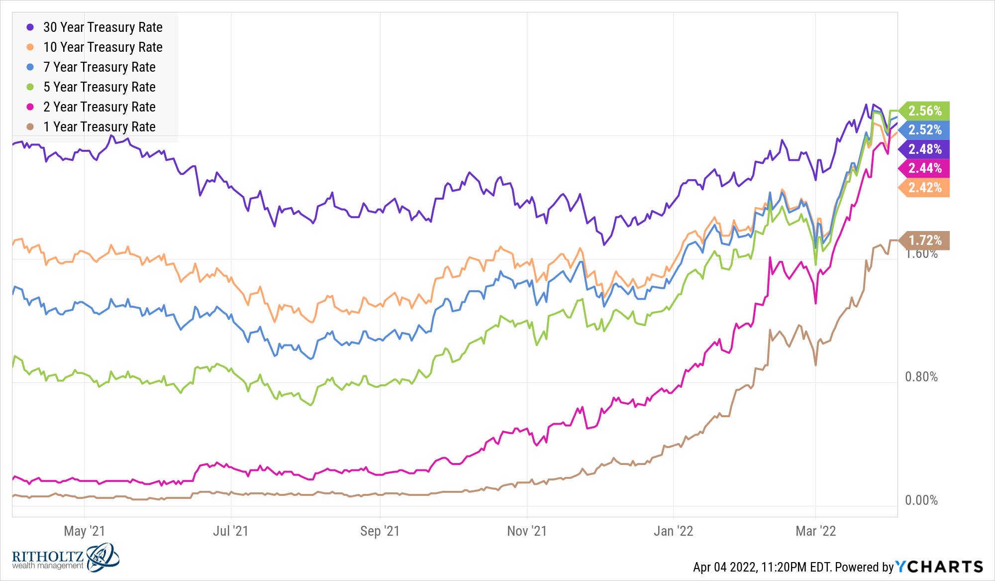
The tone of this article is much different from the CNBC piece in that they are not saying this inversion of the yield curve will predict a recession but rather that is a prediction of a reacceleration of the economy in the 1 to 2 year range. This is interesting because while the original theory on yield curve inversion was about 3 month to 10 year, this inversion occured in the 2 year to 10 year.
The graphic provided here is of low resolution. It is unclear with that was just a problem of the video or if the graphic was created that way. We see a source of the data “Federal Reserve Bank of St. Louis” (represent the home town!). This graphic presents a time scale of two years. Here we see the rise and fall of the indicator over a longer time horizon that suggests that perhaps the indicator just happened to slip below zero on its adjustment back to levels seen in 2020. We should also note that markets were very viotile in 2020 so we should not consider much from that previous bench mark. This graphic contains a line indicating where the inversion occurs (0). I find that that helps the view understand where the inversion is.
Overall I think this is a good graphic. Two years seems like not enough to judge long term placement of this indicator but the line does clearly show that the inversion occurred.
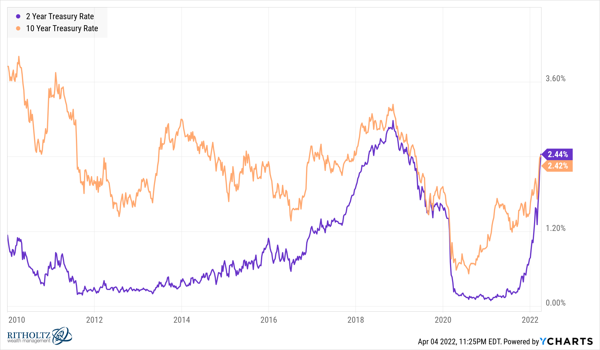
A Wealth of Common Sense#
I am not familiar with the website where I collected my last artice from but it had the best visualizations of all of them and was an article rather than inbedded video. Right away they grab you in with a very busy but informative data visualization:
This is an excellent graphic. The colors represent the length of the Treasury bill, the \(x\)-axis is time in 2 month increments and the \(y\) axis is the rate of return on the instrument. Included is a color-coded ending point, highlighting the contration of returns for all the different lengths and showing clearly the inversion of the 10 and 2 year as the ten is higher than the two. Even the five year length has a higher return than the 30 year!
Further down the page they discuss the same inversion that the previous news sources examined.
This visualization is excellent, showing the inversion very clearly and getting a little longer timescale. I am unclear on what the over-arching goal of this source was. It appeared to take the least stance on whether the inversion was a positive or a negative for the economy and was perhaps the most data driven of the three references.
Conclusion#
References#
https://www.ssc.wisc.edu/~mchinn/Harvey_yieldcurve_FAJ1989.pdf
https://ritholtz.com/2019/10/inventor-of-the-yield-curve-indicator/
https://finance.yahoo.com/video/yield-curve-indicates-reacceleration-growth-135300956.html
https://awealthofcommonsense.com/2022/04/the-predictive-power-of-the-yield-curve/