
![]()
Visualize Amounts#
To get started in visualizing, we’ll look at one of the simplest ideas, single quantaties. Let’s grab some data too!
import pandas as pa

df = pa.read_csv('https://raw.githubusercontent.com/nurfnick/Data_Viz/main/Data_Sets/iris.csv')
Bar Charts#
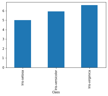
I’ll give a small bar chart of the means of the different Classes of flowers.
df.groupby('Class').SepalLength.agg('mean')
Class
Iris-setosa        5.006
Iris-versicolor    5.936
Iris-virginica     6.588
Name: SepalLength, dtype: float64
df.groupby('Class').SepalLength.agg('mean').plot(kind = 'bar')
<AxesSubplot:xlabel='Class'>
df.groupby('Class').SepalLength.agg('mean').plot.bar()
<AxesSubplot:xlabel='Class'>
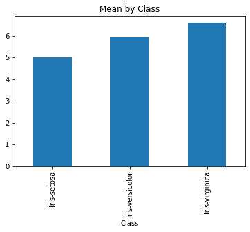
There are lots of options some of which we should be using reguarly. A title is always nice
df.groupby('Class').SepalLength.agg('mean').plot(kind = 'bar', title = 'Mean by Class')
<AxesSubplot:title={'center':'Mean by Class'}, xlabel='Class'>
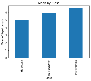
A vertical description on what the \(y\) axis represents should not be forgotten!
df.groupby('Class').SepalLength.agg('mean').plot(kind = 'bar',
                                                 title = 'Mean by Class',
                                                 ylabel= 'Mean of Sepal Length')
<AxesSubplot:title={'center':'Mean by Class'}, xlabel='Class', ylabel='Mean of Sepal Length'>
One of the complaints about a graphic like this is the length of the class titles. It takes up a lot of vertical space. With a barh you can change the orientation of the bars.
df.groupby('Class').SepalLength.agg('mean').plot(kind = 'barh',
                                                 title = 'Mean by Class',
                                                 ylabel= 'Mean of Sepal Length')
<AxesSubplot:title={'center':'Mean by Class'}, ylabel='Class'>
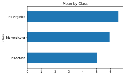
I couldn’t get the label of the values to appear, maybe you can?
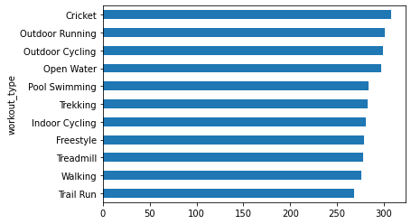
If there are lots of values, don’t use bars! Let’s see this with a different dataset.
df2 = pa.read_csv('https://raw.githubusercontent.com/nurfnick/Data_Viz/main/Activity_Dataset_V1.csv')
In the following graph it is very difficult to follow the data points across.
df2.groupby('workout_type').calories.agg('mean').sort_values(ascending = True).plot(kind = 'barh')
<AxesSubplot:ylabel='workout_type'>
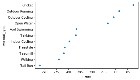
To clear this up you could use a point instead of a bar!
Dot Plots Work Well Too#
df2.groupby('workout_type').calories.agg(['mean']).sort_values(by = 'mean',ascending = True).reset_index().plot.scatter(x = 'mean', y = 'workout_type')
<AxesSubplot:xlabel='mean', ylabel='workout_type'>
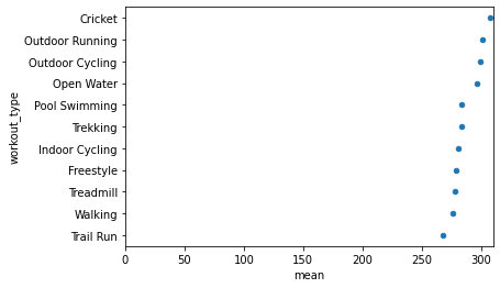
This creates other issues in that the origin of the figure is not zero. To fix that, we simply require that the x limits go from 0 to 310.
df2.groupby('workout_type').calories.agg(['mean']).sort_values(by = 'mean',ascending = True).reset_index().plot.scatter(x = 'mean', y = 'workout_type', xlim = [0,310])
<AxesSubplot:xlabel='mean', ylabel='workout_type'>
All the workout types are giving us about the same bang for our buck, at least in mean calories.
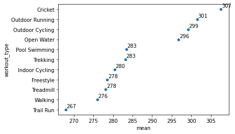
Adding Labels#
It might also be nice to see the numbers presented with the data. This is esspecially nice for a small number of quantities.
ax = df2.groupby('workout_type').calories.agg(['mean']).sort_values(by = 'mean',ascending = True).reset_index().plot.scatter(x = 'mean', y = 'workout_type')#this made the same graph as above.

for i,k in enumerate(df2.groupby('workout_type').calories.agg(['mean']).sort_values(by = 'mean',ascending = True).reset_index()['mean']): #here I loop through the values, k, and indicies ,i.
  ax.annotate(str(int(k)),[k+.2,i+.2])
Bar Charts with Multiple Data#
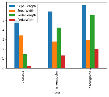
df.groupby('Class').agg('mean').plot(kind = 'bar')
<AxesSubplot:xlabel='Class'>
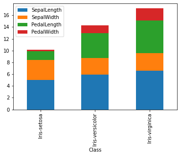
df.groupby('Class').agg('mean').plot(kind = 'bar', stacked = True)
<AxesSubplot:xlabel='Class'>
If you want to add labels, it should be simple but the version on colab is out of date… I update here.
!pip install --upgrade matplotlib
Requirement already satisfied: matplotlib in /usr/local/lib/python3.7/dist-packages (3.5.1)
Requirement already satisfied: kiwisolver>=1.0.1 in /usr/local/lib/python3.7/dist-packages (from matplotlib) (1.4.0)
Requirement already satisfied: cycler>=0.10 in /usr/local/lib/python3.7/dist-packages (from matplotlib) (0.11.0)
Requirement already satisfied: python-dateutil>=2.7 in /usr/local/lib/python3.7/dist-packages (from matplotlib) (2.8.2)
Requirement already satisfied: pyparsing>=2.2.1 in /usr/local/lib/python3.7/dist-packages (from matplotlib) (3.0.7)
Requirement already satisfied: pillow>=6.2.0 in /usr/local/lib/python3.7/dist-packages (from matplotlib) (7.1.2)
Requirement already satisfied: numpy>=1.17 in /usr/local/lib/python3.7/dist-packages (from matplotlib) (1.21.5)
Requirement already satisfied: packaging>=20.0 in /usr/local/lib/python3.7/dist-packages (from matplotlib) (21.3)
Requirement already satisfied: fonttools>=4.22.0 in /usr/local/lib/python3.7/dist-packages (from matplotlib) (4.31.2)
Requirement already satisfied: typing-extensions in /usr/local/lib/python3.7/dist-packages (from kiwisolver>=1.0.1->matplotlib) (3.10.0.2)
Requirement already satisfied: six>=1.5 in /usr/local/lib/python3.7/dist-packages (from python-dateutil>=2.7->matplotlib) (1.15.0)
import matplotlib
matplotlib.__version__
'3.5.1'
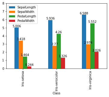
Now with the correct version it is acually really easy.
ax = df.groupby('Class').agg('mean').plot(kind = 'bar', ylim =[0,8])

for container in ax.containers:
    ax.bar_label(container)
ax = df.groupby('Class').agg('mean').plot(kind = 'bar', stacked = True)

for container in ax.containers:
    ax.bar_label(container)
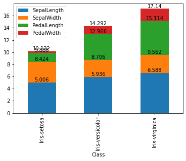
Be careful with the stacked as it is giving a cummulative total. This doesn’t really make any sense here…
Your Turn#
Using the Air B&B NYC data complete the following tasks.
Create a bar graph of the maximum ‘price’ by ‘neighbourhood_group’. Include the ‘price’ in your graph
Create a multiple bar graph with ‘neighbourhood_group’ and ‘room_type’ by looking at the average ‘price’.