
![]()
Many Distributions#
Often we have many distributions we want to look at. In the previous lecture I had three histograms on the same axis. That will be my limit! If I have more data than that, I am going to use other tools for visualization.
Box and Whisker Plots#
We have already seen box and whisker plots but I find they are very important to visualizing distributions. I will normally include a box and whisker of just one variable too!
import pandas as pa

df = pa.read_csv('https://raw.githubusercontent.com/nurfnick/Data_Viz/main/Data_Sets/Activity_Dataset_V1.csv')
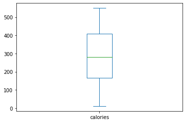
df.calories.plot.box()
<matplotlib.axes._subplots.AxesSubplot at 0x7f2aa5e439d0>
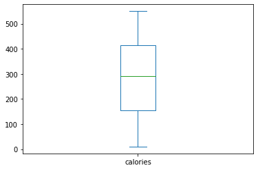
The central green bar is the median, the other four bars are the minimum (no outliers here!), Q1, Q3, and the max. An outlier would have been represented as a dot falling outside the whisker.
Let’s get many boxplots with the by command
df.boxplot(column = 'calories',by = 'workout_type')
/usr/local/lib/python3.7/dist-packages/matplotlib/cbook/__init__.py:1376: VisibleDeprecationWarning: Creating an ndarray from ragged nested sequences (which is a list-or-tuple of lists-or-tuples-or ndarrays with different lengths or shapes) is deprecated. If you meant to do this, you must specify 'dtype=object' when creating the ndarray.
  X = np.atleast_1d(X.T if isinstance(X, np.ndarray) else np.asarray(X))
<matplotlib.axes._subplots.AxesSubplot at 0x7f2aa5db1ed0>
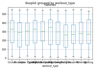
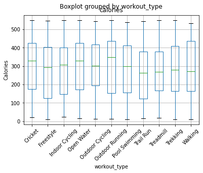
This is not a very great visualization as you cannot read the categories! Rotating the angle by \(45^\circ\) will do it.
import matplotlib.pyplot as plt


ax = df.boxplot(column = 'calories',by = 'workout_type',rot = 45)
ax.set_ylabel('Calories')
plt.show()
/usr/local/lib/python3.7/dist-packages/matplotlib/cbook/__init__.py:1376: VisibleDeprecationWarning: Creating an ndarray from ragged nested sequences (which is a list-or-tuple of lists-or-tuples-or ndarrays with different lengths or shapes) is deprecated. If you meant to do this, you must specify 'dtype=object' when creating the ndarray.
  X = np.atleast_1d(X.T if isinstance(X, np.ndarray) else np.asarray(X))
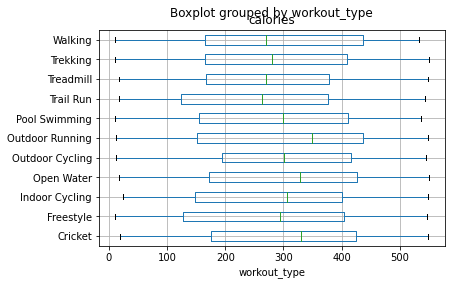
A better option would be to rotate the graph and have the number of calories on the \(x\) axis and the catagories on the \(y\).
df.boxplot(column = 'calories',by = 'workout_type',vert = False)
/usr/local/lib/python3.7/dist-packages/matplotlib/cbook/__init__.py:1376: VisibleDeprecationWarning: Creating an ndarray from ragged nested sequences (which is a list-or-tuple of lists-or-tuples-or ndarrays with different lengths or shapes) is deprecated. If you meant to do this, you must specify 'dtype=object' when creating the ndarray.
  X = np.atleast_1d(X.T if isinstance(X, np.ndarray) else np.asarray(X))
<matplotlib.axes._subplots.AxesSubplot at 0x7f6734f66dd0>
Violin Plots#
We’ll repeat the graphics above with a violin plot. I’ll need to use a different tool to make it work. Here I have choosen to use matplotlib it is actually what is running in the background of pandas to make all the other graphics we have done thus far.
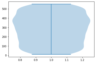
import matplotlib.pyplot as plt

plt.violinplot(df.calories)
{'bodies': [<matplotlib.collections.PolyCollection at 0x7f673512f510>],
 'cbars': <matplotlib.collections.LineCollection at 0x7f673512f310>,
 'cmaxes': <matplotlib.collections.LineCollection at 0x7f673512f390>,
 'cmins': <matplotlib.collections.LineCollection at 0x7f673512f950>}
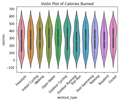
If I wanted multiple violins, I’d do the following with seaborn.
import seaborn as sns

ax = sns.violinplot(data = df, x = 'workout_type', y = 'calories')
ax.set_xticklabels(ax.get_xticklabels(),rotation = 45)
ax.set_title('Violin Plot of Calories Burned')
plt.show()
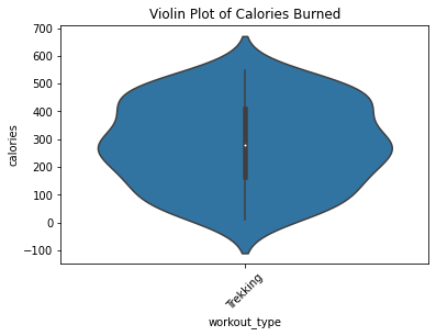
What if we wanted just ‘Trekking’
df.query("workout_type == 'Trekking'").calories.plot.box()
<matplotlib.axes._subplots.AxesSubplot at 0x7f2a924a6210>
ax = sns.violinplot(data = df.query("workout_type == 'Trekking'"), x = 'workout_type', y = 'calories')
ax.set_xticklabels(ax.get_xticklabels(),rotation = 45)
ax.set_title('Violin Plot of Calories Burned')
plt.show()
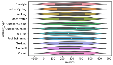
To change the direction, swap \(x\) and \(y\)
sns.violinplot(data = df, y = 'workout_type', x = 'calories')
<matplotlib.axes._subplots.AxesSubplot at 0x7f8bce402590>
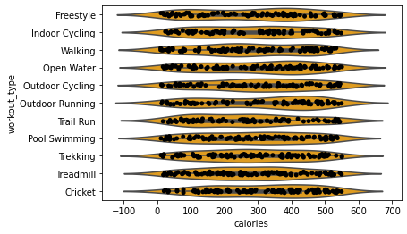
The colors mean different sports but that seems redundant to me. I also added the points with some ‘jittering’, called stripplot in seaborn.
sns.violinplot(data = df, y = 'workout_type', x = 'calories', color = 'orange')
sns.stripplot(data = df, y = 'workout_type', x = 'calories' , color = 'black')
<matplotlib.axes._subplots.AxesSubplot at 0x7f2a90792e50>
rgb= [255,78,0]
rgbscaled = []
for color in rgb:
  rgbscaled.append(color/255)
rgbscaled
[1.0, 0.3058823529411765, 0.0]
sns.violinplot(data = df, y = 'workout_type', x = 'calories', color = rgbscaled)
<matplotlib.axes._subplots.AxesSubplot at 0x7f2a8ff48990>
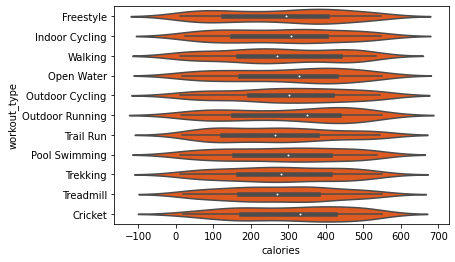
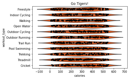
hexcolor = "#FF4E00"

ax = sns.violinplot(data = df, y = 'workout_type', x = 'calories', color = hexcolor)
sns.stripplot(data = df, y = 'workout_type', x = 'calories' , color = '#000000')

ax.set_title('Go Tigers!')
plt.show()
Your Turn#
Recreate the three boxplots in this lecture using seaborn. Add the jittered points to the final boxplot.