![]()
Graphical Integrity#
Lie Factors#
Look at Buzz Feed #13 Compute the factor.
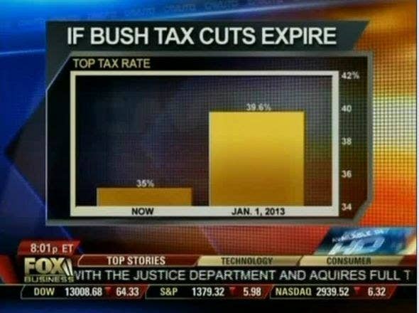
On the graphic, we see one bar as 6mm and the other as 32 mm (measures with a ruler against the screen!). We see this as:
(32-6)/6
4.333333333333333
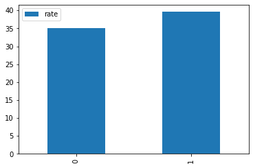
import pandas as pa

x = [35,39.6]

df = pa.DataFrame({'rate':x})

df.plot.bar()
<matplotlib.axes._subplots.AxesSubplot at 0x7f3a0ebe0050>
percentchange = (39.5-35)/35

percentchange*100
12.857142857142856
So the ‘Lie Factor’ here is:
433/12.8
33.828125
A lie factor of almost 34!
Don’t Go 3D#
Check out this link
Here is another great example where perhaps 3D did add something? You decide!
Six Principles of Graphical Integrity From Tufte#
Representation of numbers, as physically measures on the surface of the graphic itself, should be directly proportional to the numerical quantities represented.
Clear, detailed, and thorough labeling should be used to defeat graphical distortion and ambiguity. Write out explanations and label important events.
Show data variation not design variation
In time-series displays of money, adjust for inflation.
Graphics must not quote data out of context
The number of information carrying dimensions depicted should not exceed the number of dimensions in the data.
Your Turn#
Head over to Oklahaoma Research Day. Spend some time looking at three posters that include statistical charts or graphs. Include links to each. Discuss the strengths and weaknesses of each. Do they display excellence or do they lie?
Check out the following graphic

The percent change is not to scale. What is the lie factor of this graph?