
![]()
Visualization Conclusion#
What do you think will be on the exam?
Why Do We Visualize#
Visualization allows use to see many datapoints and once. It allows us to compare those points quickly and efficiently. It allows us to see trends and look for interesting aspects about our data that may be hard to parse out without a graphic. Graphics we have done in this course.
Bar Chart
Histogram
Violin Plot
Box and Whisker Plot
Scatter Plot
Correlation Heatmap
Error Bars
Pie Charts
Mosaic Plots
import pandas as pa
import matplotlib.pyplot as plt
import seaborn as sns

df = pa.read_csv('https://raw.githubusercontent.com/nurfnick/Data_Viz/main/Data_Sets/bank.csv')
df.head()
| age | job | marital | education | default | balance | housing | loan | contact | day | month | duration | campaign | pdays | previous | poutcome | y | |
|---|---|---|---|---|---|---|---|---|---|---|---|---|---|---|---|---|---|
| 0 | 30 | unemployed | married | primary | no | 1787 | no | no | cellular | 19 | oct | 79 | 1 | -1 | 0 | unknown | no |
| 1 | 33 | services | married | secondary | no | 4789 | yes | yes | cellular | 11 | may | 220 | 1 | 339 | 4 | failure | no |
| 2 | 35 | management | single | tertiary | no | 1350 | yes | no | cellular | 16 | apr | 185 | 1 | 330 | 1 | failure | no |
| 3 | 30 | management | married | tertiary | no | 1476 | yes | yes | unknown | 3 | jun | 199 | 4 | -1 | 0 | unknown | no |
| 4 | 59 | blue-collar | married | secondary | no | 0 | yes | no | unknown | 5 | may | 226 | 1 | -1 | 0 | unknown | no |
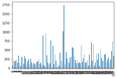
df.loc[:100].duration.plot.bar()
<matplotlib.axes._subplots.AxesSubplot at 0x7fc0da308090>
ax = df.groupby('education').duration.agg('mean').plot.barh()
ax.set(title = "Average Duration by education Level")
ax.set(xlabel = 'Average Duration')
plt.show()
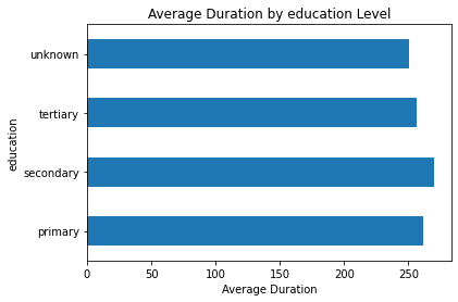
What does this graph show? Everybody has about the same duration…
Histogram#
ax = df.duration.hist(bins = 25)
ax.set(title = "Histogram of Duration")
plt.show()
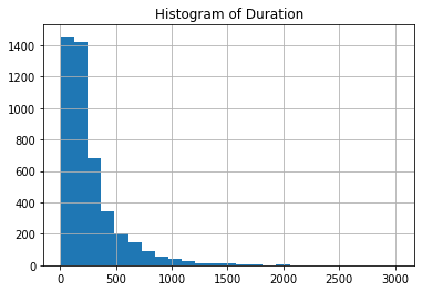
Looks like there are some serious outliers in duration
Violin#
ax = sns.violinplot(data = df, x = 'duration', y = 'education')
ax.set(title = 'Violin of Duration and Education')

plt.show()
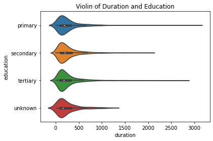
Seems like the unknowns dont have the outliers. Perhaps only un-educated and over-educated have longer waits.
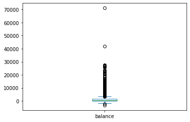
Box and Whisker#
df.balance.plot.box()
<matplotlib.axes._subplots.AxesSubplot at 0x7fc0dffa8910>
sns.boxplot(data = df, x = 'balance', y = 'housing')
<matplotlib.axes._subplots.AxesSubplot at 0x7fc0dff2a790>
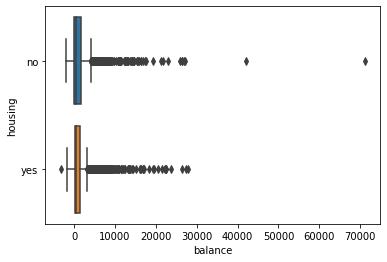
More than $3k is an outlier!
Scatterplot#
ax = sns.scatterplot(data = df, x = 'balance', y = 'duration', hue = 'housing', style= 'education')
ax.set(title = "Scatter")

plt.show()
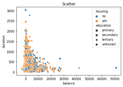
Non-linear trend! No money: Wait!:: Lot’s of money:Close the deal!
Correlation Heatmap#
ax = sns.heatmap(df.corr(),vmin = -1)
ax.set(title = 'Heatmap of Banking')

plt.show()
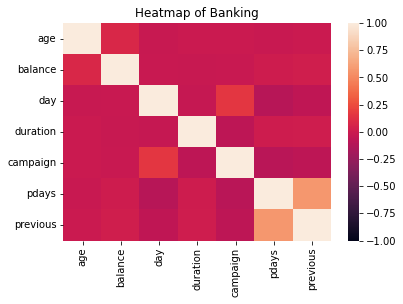
campagin and day seem to have some correlation.
Error Bars#
df.groupby('education').duration.agg(['mean', 'std', 'count'])
| mean | std | count | |
|---|---|---|---|
| education | |||
| primary | 261.709440 | 271.988443 | 678 |
| secondary | 269.863833 | 260.896979 | 2306 |
| tertiary | 256.881481 | 254.290937 | 1350 |
| unknown | 250.449198 | 241.189640 | 187 |
import numpy as np

df1 = df.groupby('education').duration.agg(['mean', 'std', 'count'])
def SE(std,n):
  return 2*std/np.sqrt(n)


df1['SE'] = df1.apply(lambda x: SE(x['std'],x['count']), axis = 1)
df1.plot.bar(y = 'mean', yerr = 'SE')
ax.set(title = "Average Duration by education Level")
ax.set(xlabel = 'Average Duration')
plt.show()
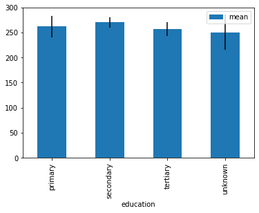
All have the same mean…
Your Turn#
Sumbit at least two graphics you made while thinking about what may be on the exam.