
![]()
Graphical Excellence#
“Excellence in statistical graphics consists of complex ideas communicated with clarity, precision and efficiency”
show the data
induce thoughts about the data
avoid distortions
present many numbers in a small space
make large datasets coherent
encourage the eye to compare different pieces of data
reveal the data at several levels of detail, from broad to fine
serve a reasonaly clear purpose: description, exploration, tabulation or decoration
be closely integrated with the statistical and verbal descriptions of a data set
The Visual Display of Quantiative Information by Edward Tufte second edition
Let’s examine a modern example and see if we can highlight the graphical excellence.
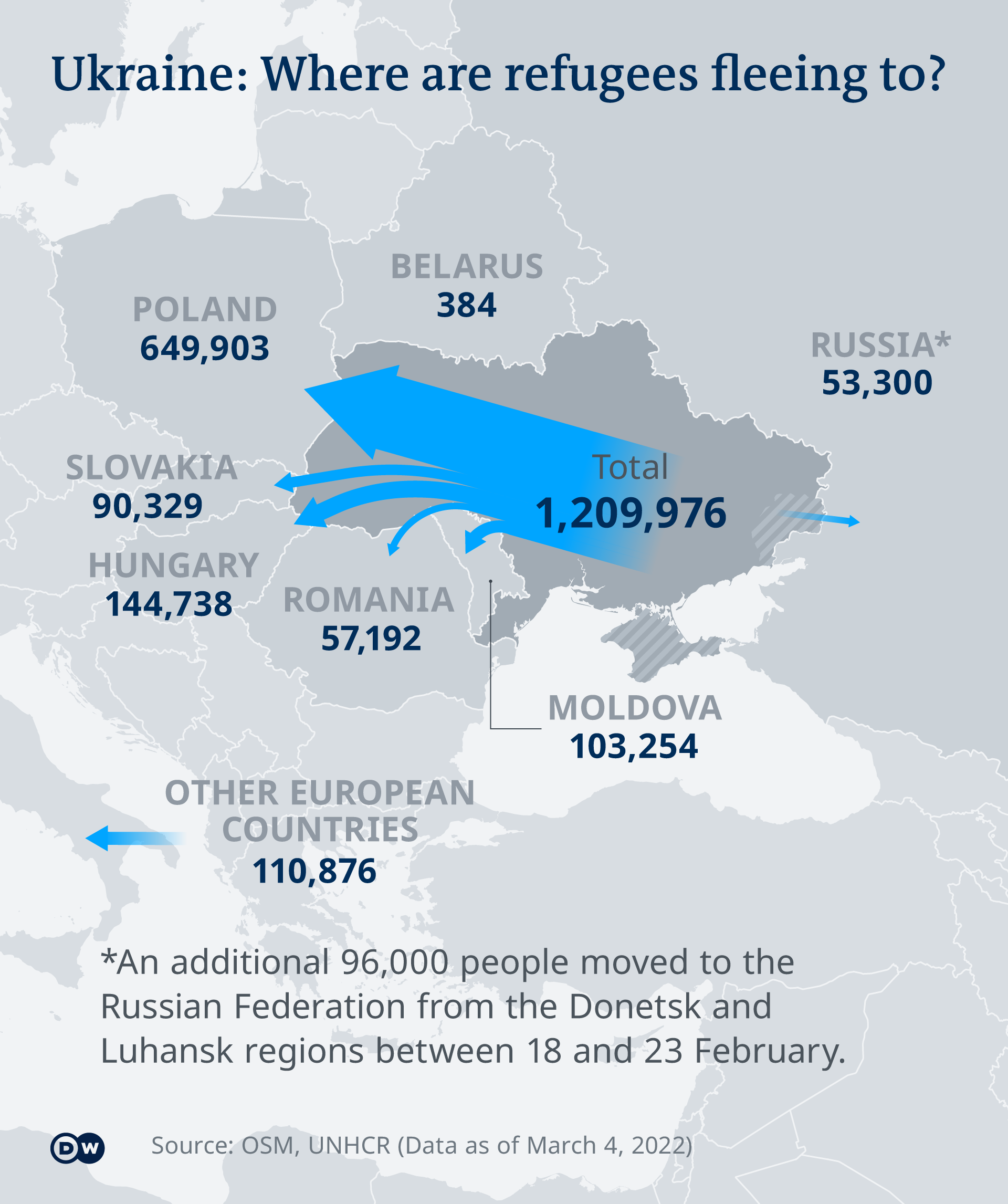
Gathered from here on 3/7/2022.
My next example is from 538 and their predictions for the final outcome of the premiere league, https://projects.fivethirtyeight.com/soccer-predictions/premier-league/.
This one is interactive so we’ll have to navigate to it!
Historical#
Minard’s Russia Campaign.
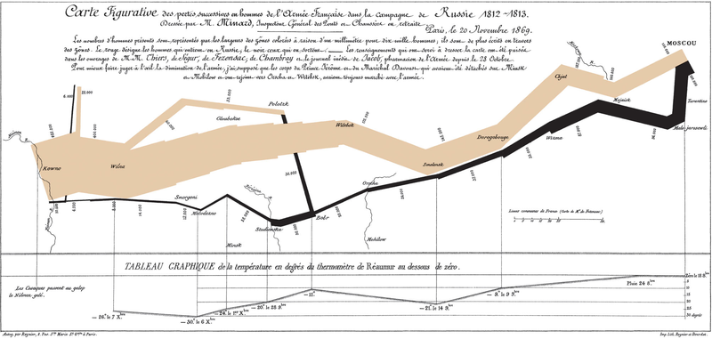
From Wikipedia
Your Turn#
Examine John Snow’s map of cholera outbreak in 1854 for ‘graphical excellence’. Discuss the highlights of the graphic.
Find a modern reference and dicuss the excellence displayed. Include a link and image in your report.
